Info
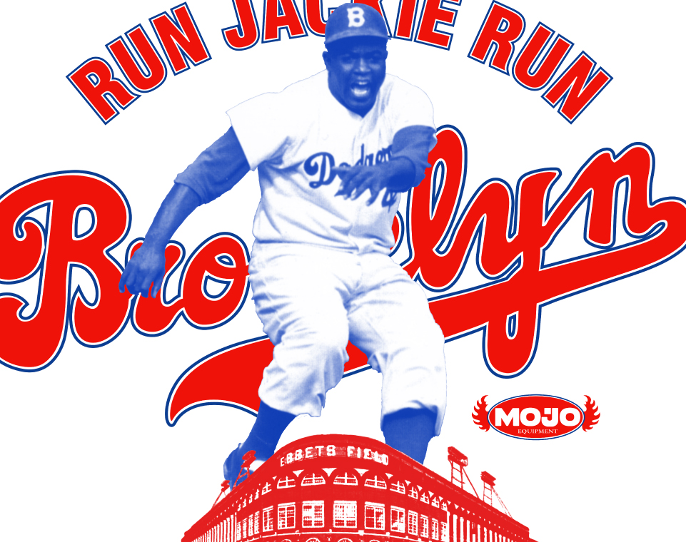
Mojo Equipment was born out of a shared vision between Joe Patterson (known as Cooking Joe P) and myself. We tapped into the Brooklyn vibe even before it became the iconic scene it is today.
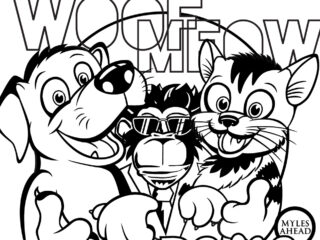
Based in NYC, Mojo Equipment was more than just a t-shirt brand; it was an expression of art and pop culture, striving to craft timeless pieces that could seamlessly blend into any era. “Celebrating the Audacity of Life” was the tagline I coined, drawing inspiration from my father’s frequent use of the word “audacity” during my childhood. This venture was indeed audacious. With an adventurous spirit, we boldly introduced our creations to stores throughout Brooklyn and Manhattan, diving headfirst into the unknown waters of the retail world.


Brief
For a startup, crafting the perfect logo isn’t just an initial step, it’s a foundational one. The logo serves as the very essence of the company’s identity and branding blueprint. Its design is paramount, as it sets the tone and narrative for all subsequent brand expressions and engagements. A well-executed logo can make all the difference in positioning a startup for success.
Delving into logo design is my most cherished facet of graphic design as an art director. The journey from understanding a company’s ethos to witnessing the final design unfold is deeply rewarding. Crafting a logo demands thoughtful decisions, blending both a unique mark and a distinctive logotype. With Mojo Equipment, the challenge was to intertwine a sense of timelessness with a dash of whimsy.
“Mojo” encapsulates a spirit of vigor, mystique, and allure. The term “Equipment” was chosen as a distinctive alternative to more conventional terms like clothing or apparel.


