Info
Brand Identity for Employers Resource Association
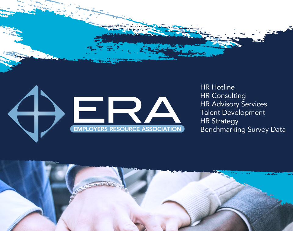
A comprehensive visual language was crafted, encompassing everything from a revamped logo to typography and color schemes, mirroring both the new brand image and ERA’s fundamental principles. As a provider of human resources training, ERA sought a design that was both assertive and approachable. Recognizing their need for a holistic brand transformation, I delivered a fresh logo, brand guidelines, print materials, and digital presentation assets.

Brief
Since 1946, ERA has operated from Cincinnati, Ohio, offering comprehensive human resource support to businesses both locally and across the nation. Their branding objective was to portray themselves as a modern enterprise that upholds timeless values and standards. The journey began with the logo design for this initiative.


Branding Guidelines
Brand guidelines serve as a set of documented principles and directives that dictate how a brand should be depicted. This manual encompasses elements integral to a brand’s identity, including logos, fonts, colors, images, and more. Adhering to these guidelines guarantees a uniform brand presentation.

Design
Following the development of ERA’s logo and brand guidelines, marketing material was quickly needed.
To effectively introduce ERA’s rejuvenated image, a range of materials from corporate identity packages to brochures and PowerPoint presentations were promptly developed. Marketing a company’s new brand is crucial. Not only does it signal a company’s evolution or strategic shift, but it also re-engages existing clients and attracts potential ones. A consistent and well-promoted brand sets a strong foundation for a company’s image in the market, ensuring that its values, mission, and offerings are clearly communicated and resonated. It’s a pivotal step in ensuring that the company remains relevant and continues to thrive in a competitive landscape.


